Create a design system with atomic methodology and Sketch tool.
By (Product Designer, Saba Software)
This post originally appeared on the Hannah C. Design blog.
We all know the power of product consistency. Providing consistent user experience across different modules of your product can boost the usability. Once the users learn how to interact with a certain pattern in the system, they would assume the same workflow could apply on the other parts of the software. Maintaining product consistency will not only reduce the learning effort for users to navigate within the application, but also benefit the whole product development cycle, from design, engineering, to QA testing and documentation.
I recently helped our team build a design pattern library. This library will serve as a style guide to our design team internally. It was created in Sketch tool so that designers in the team can easily grab any components needed for future design projects. We use a Sketch plugin called Measure to export specs that our front-end development team can easily inspect element properties to create CSS style sheets. We also annotate styles and rules for testing and documentation reference.
Methodology: Atomic Design
Like many other products in the industry, our platform evolves from decade-old technologies to trendy modern UIs on web and mobile. Inconsistency is unavoidable during this product evolution. When we first started this project, we went through a series of exercises finding inconsistent typographies, styles, colors, and patterns in the system. We used Frontify to collect a list of incorrect UI examples, as well as to identify one or two examples that we think are correct or acceptable. Even after identifying these working patterns, there is still a need to refresh the look and feel. Thus, a better methodology is required to create this design system.
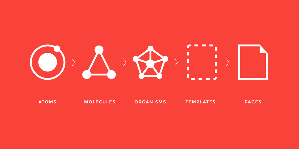
Inspired by Future Learn’s design blog, I introduced Atomic Design as our methodology. The goal is to create a well-structured and sustainable design system, which contains five distinct levels as shown on the figure above: Atoms, Molecules, Organisms, Templates, and Pages.
Create a Pattern Library with Sketch
 1. Atoms
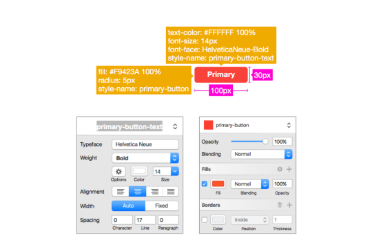
Atoms in our system refer to elements like form labels, buttons, links, etc. Let’s take a button as an example: we would need to define the typography of the text, background color, border style, button size, and so on. Sketch provides a very easy way to organize your Text Styles and Shared Styles. In this example, I created a Text Style called “primary-button-text”, which defines the text properties like typeface, weight, color, alignment, etc. I also created a Shared Style called “primary-button” for the button style, which defines the button’s color, borders, shadows, etc. Defining Text Styles and Shared Styles at the atom level, helps ensure the consistency of this pattern library, and also make it easier to organize and maintain. Besides that, we also need to annotate other properties at the atom level — here for the button, I specify the size of the button, as shown below.
 2. Molecules
When atoms like a primary action button and a secondary action button are bonded together, they become a molecule, serving as the smallest fundamental unit of a compound. Space in between the two buttons can be defined in the CSS style sheet’s padding and margin properties. Rules of combining these two buttons into one molecule are needed — in this case, one rule can be: Always place the primary action button on the right, and the secondary action button on the left.
 3. Organisms
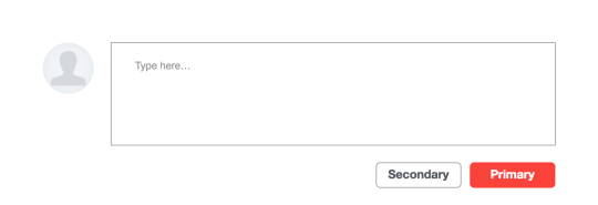
This primary and secondary buttons group can be used to form totally different organisms. It can be part of a modal window, or in our example, a commenting section. This organism consist of different molecule types — a profile picture, a text input area, and a buttons group. Organisms allow us to design standalone, portable and reusable components, which also require us to make very clear rules of how to combine different molecules under different scenarios. Sometimes, these rules can become very complex. We need to make sure the annotations of the rules are written clearly and cover as many use cases as possible.
4. Templates
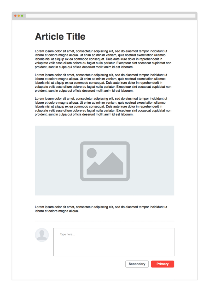
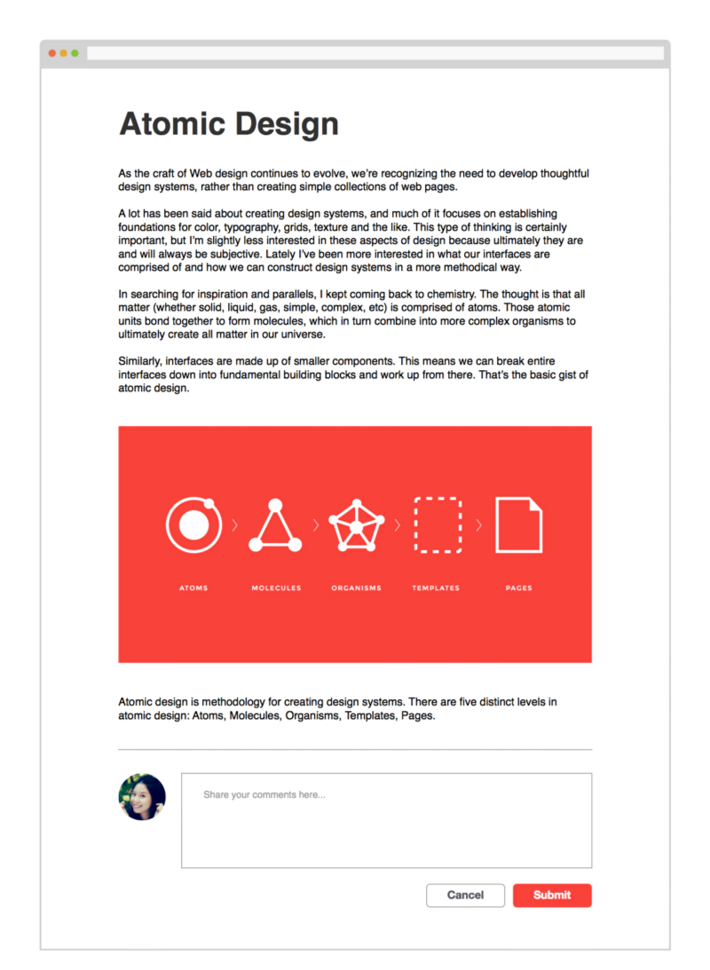
Putting together an article organism and the commenting section described above, we make an article page template. Templates are very useful for our fast-paced agile development cycle, since the front-end team turns them into HTML format and reuses them for future development reference. Annotation or detailed specs will help engineers to implement the HTML templates correctly.
5. Pages
Replacing placeholders with real content brings the templates into live pages that users actually see in our application. Pages are the final deliveries and also the highest level of this Atomic Design System.
Annotations and Documentations for the Atomic Design System
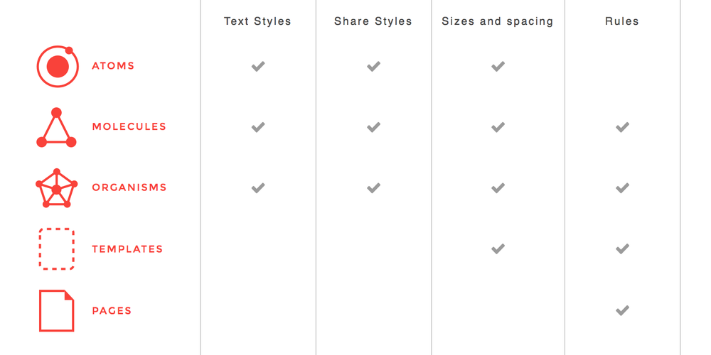
As we mentioned before, clear annotations are important for future design, development, QA testing, and documentation cycles. Key elements to be marked include Text Styles, Share Styles, sizes and spacing, and rules. Here I summarized what should be documented on each level of the Atomic Design System. Please see the following table:
Exporting Detailed Specs for Front-End Development
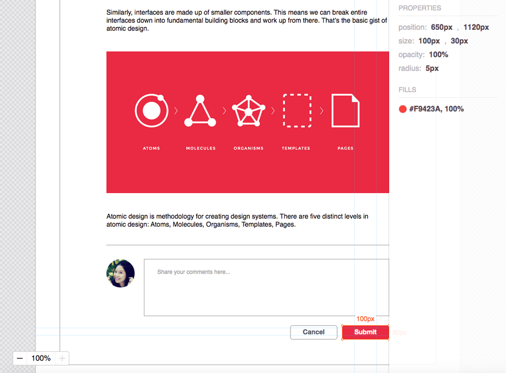
Another trick for providing detailed specifications to engineers can be using Sketch plugins that generate style guides and resources automatically. Zeplin has more features but only give you one project for free. I use Measure, an open source, lightweight project. You don’t need an account to use Measure. Here is a screenshot of specs exported by Measure:
This pattern library project is still in progress. We are now partnering with our front-end team and hope to ultimately build a complex HTML/CSS library that will power consistency across our product’s end user experience.
About the guest blogger: Hannah Chen is a product designer Saba Software who is obsessed with handcrafting, world traveling , yoga, photography, food, arts, music and tech. Follow her blog and on Twitter at @HannahCDesign.
 1. Atoms
 2. Molecules
 3. Organisms